Spiders activity graphs
Today we are introducing a new feature called Spider activity graphs. These allow you to visualize quickly how your spiders are working, and it's a very useful tool for busy projects to find out which spiders are not working as expected.
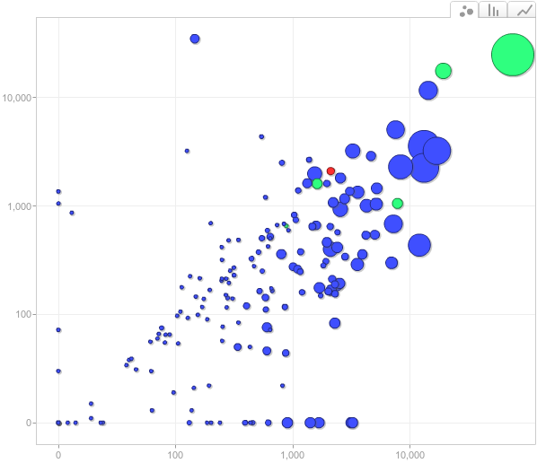
This new graph shows you a snapshot of your project each day, displaying one dot per spider. The best way to illustrate how it works is to look at a particular example. This a snapshot of a single day in a busy project (each dot is a spider running that day):
That is just one day, from the last 30 days covered by the graph (which you can quickly traverse). Here is how the graph is read:
- each dot is a spider
- the X axis is how many pages the spider crawled
- the Y axis is how many items the spider scraped
- the color is how many jobs of that spider run
- the diameter is how long the spider take to run
Once we learn how to read it, we can get a sense of the following things by quickly glancing over the graph:
- how many spiders were running that day
- which spiders take the most time to run (the largest dots) - you can see spider names by hovering the mouse over the dots
- which spiders are more (and less) efficient in terms of items/pages ratio
- which spiders are broken, and how badly. For example, we can quickly realise all dots in the the bottom are spiders scraping zero items and, the further to the right they are, the worse (because they scrape more pages and take more time, without scraping any item). This allows us to quickly identify and disable poorly behaving spiders, to save resources, until we get a chance to fix them.
- which spiders were under development that day, because those spiders are typically run more often than the ones in production. The red and green dots there indicate those spiders.
- which spiders are feed-based (the dots on the left) because they fetch a single page (the feed url) and return a lot of items. API-based spiders also tend to have high items/pages ratios.
As you can see, this graph concentrates a lot of information into a single place, which allows to quickly grasp an idea of how the spiders are working and how they compare against each other.
There are other useful features not mentioned here, like being able to track a specific spider (or group of them), changing how metrics are displayed (for example, mapping colors to errors instead of job counts), and playing an automated animation over time. Our customers can already enjoy this new report in the panel, by going to Reports -> Spiders activity.
These are some of the features you can expect from our platform, and it covers both the Scrapy Cloud and Autoscraping services. We believe visualization plays an important role when monitoring and keeping track of many spiders, even if you are lucky enough to have time to dive into detailed reports and lots of numbers (most of us aren't).

